this photographer, richard renaldi did this photography project where he asked strangers to pose together for a portrait on the streets. the results were some interesting and in some cases uncomfortable looking photos...check them out:
http://www.renaldi.com/photographs/tstrangers1.html
Thursday, December 4, 2008
Thursday, November 20, 2008
Performance Art Piece
My performance art piece... which i couldn't think anything better to call it other than "untitled". it almost seems more like a social experiment than a performance of art... but i think it qualifies because hopefully when you "experience" it, it will make you think, which is what art (should) do.
if you weren't there, what i did was show the class an image of a drawing i had done while messing around with india ink on watercolor paper... the reason i used this specific drawing was because it was done without any pre-planning or any thought. i just played the music and drew whatever i heard...every instrument represented in the finished product.
i then played specific parts of 3 different songs for the class, and told them that one song was the inspiration for the image. i asked them to look at the picture while they were listening, and try to isolate the different sounds and specific instruments, and just as they were listening try to see whatever shapes the music made. (i realize now after doing this that i'm asking people to listen really carefully on a much deeper level than they would normally, and doing it on the spot)
so basically i asked them to try to get inside my head while i was drawing and listening and using this india ink to translate what i heard into shapes on a piece of paper.
the songs were
all i need by radiohead (2:41 to about 3:10)
black white by the ravonettes (just the first 30 seconds of the song)
howl by black rebel motorcycle club (0:40 to 1:10)
the results were interesting, nobody in the class thought it was "all i need" by radiohead when that was in fact the song behind the drawing.
"black white" by the ravonettes drew 4 votes. I chose this song because it to me sounded very unlike the drawing... it sort of marches on and just sounds rigid and chanty...not swirling around with different textures like in the image.
the rest of the class (about 18 votes) favored "howl" by black rebel motorcycle club. I probably shouldn't have chosen this song for this though, because now that I realize how extra hard i'm expecting people to have to listen in order to get what I was doing, i probably shouldn't have used a song that really sounds like it could be the image. I chose it because it was kind of loud, like the part of the radiohead song i used, and i thought maybe people wouldn't see the finer details as depicted in the image.
so basically, i didn't really get any conclusive results... but i hopefully made the class think a little bit at least, and maybe see the correlation between the song and the image if they listen again, a little more closely this time.
Interesting Music Video
I recently saw this video for the first time, and after learning that it was "filmed" in the Carrollwood area of Tampa and some in Miami, i was intrigued. Instead of cameras, they used 3-D mapping technology to create the landscapes and the glitchy and hard to depict house party scene at the end.
i'm not really sure what else to say about this video, it's just really eerie and interesting. i love the dissolution of the entire landscape, paralleling the line in the song "infrastructure will collapse" .... i don't know, see for yourself.
Tuesday, November 4, 2008
xerox project
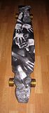
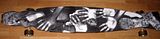
my xerox project was a little more of a statement of my experience learning how to ride the long board than a self portrait using xerox.
as with learning how to do anything that requires riding, i fell a lot. conveniently, the places i landed on were very often my forearms, face, hands, and when i was lucky my feet. i incorporated all of these elements with the xerox images of my hands, feet, etc...
two notable features were the foot that extends from the front of the board, with the toes hanging off. this was the first "trick" i learned, where i could push off from the back of the boards, resting on the back trucks and then "walking" forward while traveling, and letting one set of toes hang off the front, with the other foot, resting right about the front trucks... it's called toes on the nose.
anywho..here are some pictures of the thing:


Monday, October 13, 2008
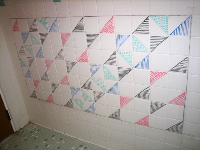
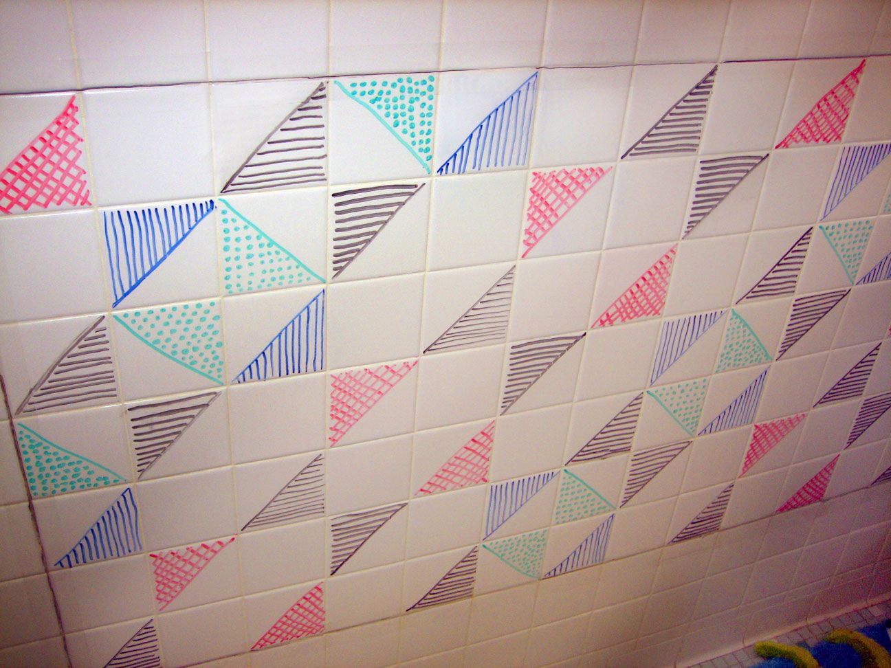
Grid Art Project
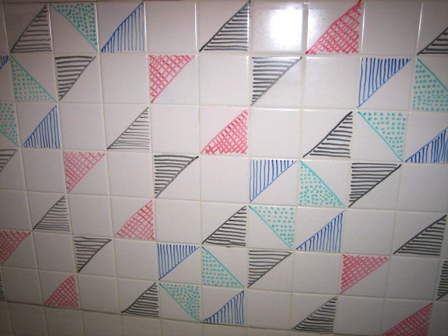
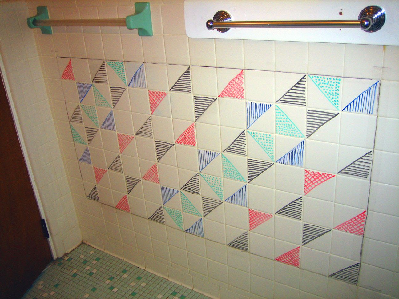
I was looking at patterns in the tiles on the floor of my bathroom and I kind of just came up with my own pattern on the walls, which were just plain white tile.
I used dry erase markers on the tiles, and clear tape over the grout, so it wouldn't stain.
click on the image for the full version.
I used dry erase markers on the tiles, and clear tape over the grout, so it wouldn't stain.
click on the image for the full version.
Tuesday, September 23, 2008
damien hirst
upon looking at damien hirst's work and also reading about his career...i'm not really that impressed with his actual work, but more of how he's changed the art world, especially in recent times.
I think what i notice most about hirst is not his actual technique, as many of his works have been accused of being plagiarized in some way or another, but more of the ideas behind his works...which can be understood further by looking at the titles of each piece. He is known for being somewhat "outrageous", but in reality, most art is trying to be outrageous just for the sake of being outrageous. Damien hirst definitely tries to be outrageous in his work (using grotesque displays of nature such as in "mother and child divided" which features a severed cow suspended in formaldehyde). But I think more of his outrageousness comes from his celebrity, the price of his works, and his choice of taking other forms that may seem like plagarism.
the fact that hirst has achieved such a high level of celebrity has much to do with the press he's received from lawsuits and accusations of plagiarism but probably more to do with the price that many of his works have sold for in the past. in june 2007 he set a new world record for the most expensive work of art by a living artist when he sold "Lullaby Spring" for 19.2mil. His most famous piece perhaps is "For the Love of God" which features a skull encrusted with diamonds... this piece had an asking price of $100 million. The piece sold, but not right away- and it was sold to a consortium that includes Hirst himself and his gallery.
Hirst's art seems to not be in the actual physical works themselves, but the implications of each. by looking at the different titles the viewer can gain more insight into what hirst intended with each piece. his ridiculous prices for his works have changed the art world with a dramatic action, which is a big part of what art is about.
Monday, September 15, 2008
importance of soundtracks to silent films
upon seeing the early motion pictures of Edison, i noticed the use of music as soundtrack...music that was clearly added post production.
It's no secret that adding a soundtrack to motion pictures enhances the viewing experience, but it's interesting to see the first examples of this practice and think...why? who thought that would be a good idea?
If you watch "Carmencita" you see a woman dancing around, and cheerful dance music is played. Though early viewers would probably have been just as mesmerised by the prospect of a moving picture...the element of sound really captured the viewer by taking over not only their sense of sight, but hearing as well.
The addition of music also gives the picture more meaning. In "Carmencita" for example, the music is neccesary to understand why the woman is dressed and dancing the way she is. The music is fun and upbeat, as are her motions. Without sound, it looks like a woman flailing around...and though we can infer that she's dancing, a person viewing this film today without sound may not understand that.
The addition of sound not only serves a pratical purpose in most motion pictures, but it also adds an artistic quality. We see this today with music videos, which are a way to emphasize certain meanings in pop songs. With movie and audio, a person can create their own work of art with sound and motion as the medium.
Wednesday, September 10, 2008
My paper on Pelleas at Melisande
Pelléas et Mélisande
Pelléas et Mélisande is a libretta with music written by Claude Debussy. It was adapted from the play Pelléas et Mélisande, written by Maurice Maeterlinck. It was Debussy’s only completed opera, first performed in 1902. The rendition of the opera that I watched was performed in 1999 in Glyndebourne. Director Graham Vick designed the set, and Andrew Davis conducts Pelléas et Mélisande. The main performers include Christiane Oelze, Richard Croft, and John Tomlinson. The most striking aspects of this production were not pertaining to the music and story, but rather in the set design, and the wardrobe of the performers.
When viewing Pelléas et Mélisande, I personally focused on Act I, as it introduces the setting and characters to the audience and generally makes the most important impression. I found the display of the stage to be interesting and beautiful, but the performance itself a little bit dry…even boring—maybe because I speak very little French. The set design and wardrobe were really the most impressive aspect of Act I. The staircase and wall décor really emphasized the feeling of wealth and beauty that the characters were living in, and made for an interesting stage for the audience to study should they not understand the lyrical description of the story (which in in French). The performers were very authentically dressed for wealthy people living in medieval times, with fancy and complicated wardrobe, and very expressive makeup and hair. Despite these technical aspects, I was still somewhat unimpressed overall by the performance. This may be due in part to the fact that I’m relatively new to opera, or maybe because it was simply the first act, and there hadn’t yet been a climax in the actual story, or a song that stood out from the others.
Technology is very important to Pelléas et Mélisande in terms of set design. The set is elegant and Victorian, and the entire stage comprises only one room, which because of it’s size and intricate decor delivers the audience to the notion that wealth is involved with the characters. Act I is comprised of indoor and outdoor scenes, which was interesting to see on a stage that is composed of one very large room. In order to differentiate between these two different settings, Vick uses very low lighting to depict the outdoor scenes (which take place in dark or darkening forests) and focuses softer, almost warm lights on only the performers, basically blacking out their surroundings. This is no doubt an interesting way around the one-room set restriction, but it especially works because of the setting written into the story—the dark forest. During the indoor scenes the lighting is much brighter on the surroundings, showing off the elegant and beautiful details of the Victorian room that makes up the stage. This was important for Vick to create because the indoor scenes in Act I take place in a castle in medieval times—a place of great wealth and elegance that comes with royalty. The furnishings of the set help convey the setting of the story to a non-French speaking audience.
Understanding only the setting is not adequate to understanding the story, and this is where the other important technological factor becomes important—costume and makeup design. Because Pelléas et Mélisande is an Opera, the characters sing rather than speak, making it easy to determine which characters are more important by seeing which performers are doing the solo singing. However, the makeup and wardrobe of these performers bring their roles in the story to a more meaningful level. The main characters are dressed in fancy, almost extravagant clothes with many different colors and intricate patterns. Less important characters to the story though maybe still wealthy, were dressed in less extravagant, but still fancy clothing, and were muted with less colorful patterns to demonstrate their less important places in the actual storyline. Subtly, coloring of makeup is another factor that determined the importance of a character. More important characters are made up to look more human and natural against the stage lighting, while secondary characters seem washed out by not only the lighting of the theatre, but also with dull, grayish, and largely monotone makeup. This use of color in the costumes and the makeup of the performers is not only aesthetically pleasing, but also distinguishes the importance of characters on stage to help further the audience’s understanding of the story.
As a production overall, I think Pelléas et Mélisande is an interesting experience. The actual storyline of this opera may seem ambiguous to an unseasoned audience such as myself, but the production itself does an excellent job of conveying the general ideas of the plot through the use of technology. With interesting set designs, and innovative ways of displaying such a limiting one-room set, no scene in Act I is compromised. In addition, with costumes and makeup that spare no detail, and intentionally contrast the importance of the different performers, the audience is able to understand what is happening in the story.
Monday, September 1, 2008
art and myself...
i'm not entirely sure what art and technology is going to entail, but being art minded especially when modern technology is utilized, I'm pretty interested and excited to see what I'll learn this semester.
i'm an art student (I am very much on the fence about my major being either graphic design or advertising) but I haven't always been so into it...it wasn't until my sophomore year of high school when I started getting really interested in my graphic design class that i discovered i had sort of an affinity for art. i had never gotten as much praise from any of my teachers before, and it was refreshing to feel like i was really pretty good at something...something that came so easy to me. i took many graphic design and photography classes throughout high school, and entered UT as a graphic design major.
that was 2 years ago, however...and aside from 2 semesters of photography, i've been very disconnected from my artistic side. I used to bring my digital camera wherever i went, and take pictures that i would later 'play' with in photoshop, and post them online, but i haven't done that in the past couple of years. I'm hoping that this semester between my design class and art and technology that i'll rediscover my love for digital (or any) arts...
Subscribe to:
Posts (Atom)